These charts present three color-coded time series. The gray line represents the annual (or seasonal) temperature value. The blue line shows the overall trend in a fashion that smoothes out the year-to-year variability in temperature. The light blue shaded area represents the 95% confidence interval for the trend. The smoothed temperature is constructed using a locally estimated scatterplot methodology known as LOESS.
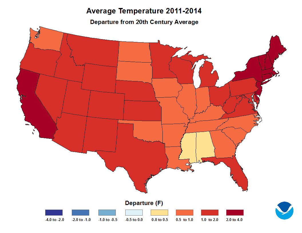
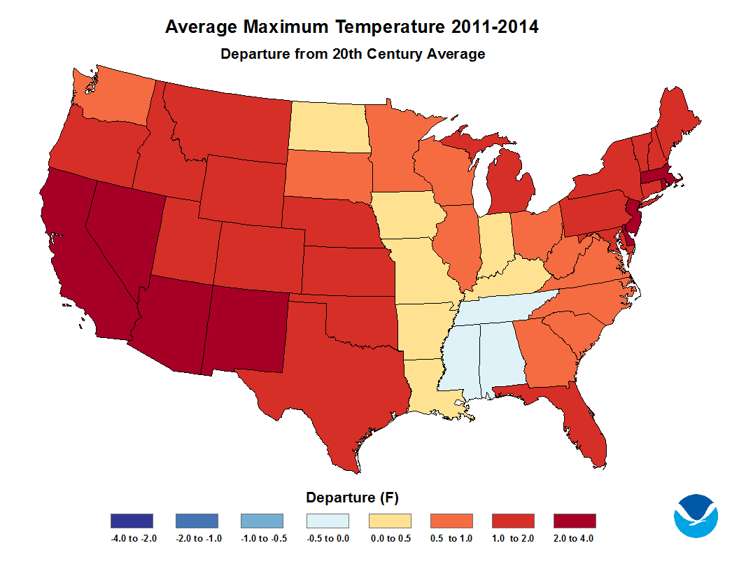
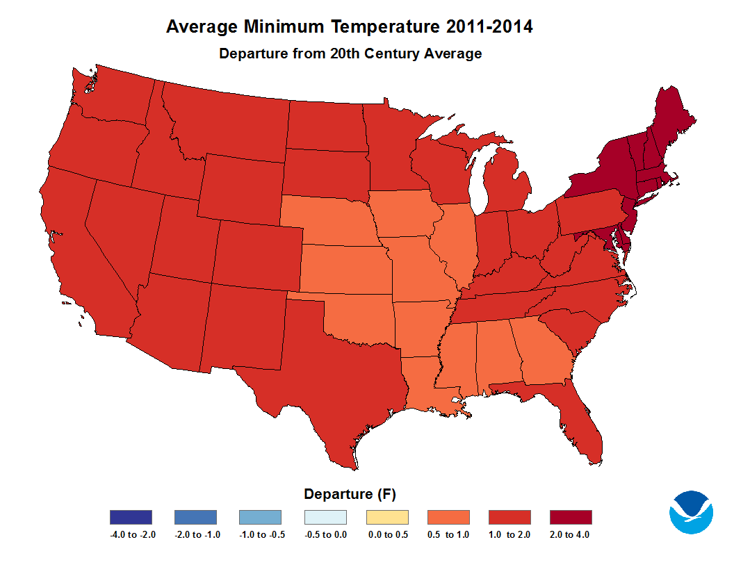
These maps show how the decadal average temperature for each state differs from the 20th century average. First, the average temperature for each state from 1901 to 2000 was calculated using the nClimDiv data set. Next, the average temperature for each state was calculated for each decade (1895-1900, 1901-1910, 1911-1920, ..., 2011-2014). Finally, each state's 20th century average was subtracted from each of its decadal averages. Negative values indicate that a decade is cooler than the long term 20th century average. Positive values indicate that a decade is warmer than the long term average. This process was done for minimum temperature, average temperature, and maximum temperature.


")


")

")


")


")
")

")